Visit Us On:
Creating the perfect CSS gradient by hand is frustrating. You tweak hex codes, guess at percentages, reload the page, squint at the result, and repeat until your eyes glaze over. By the time you get something passable, you've wasted 20 minutes on what should've been a 2-minute task.
The Gradient Generator fixes that. Pick your colors, adjust the angle, see the result instantly. Everything runs locally in your browser - no accounts, no uploads, no tracking. When you're happy with what you see, copy the CSS and move on with your life.
Here's the complete tutorial.
Step 1: Choose Your Gradient Type
At the top of the Gradient Generator, you'll see three gradient type options: Linear, Radial, and Conic. Linear gradients flow in a straight line (top to bottom, left to right, or any angle in between). Radial gradients spread outward from a center point in a circular pattern. Conic gradients rotate around a center point like a color wheel.
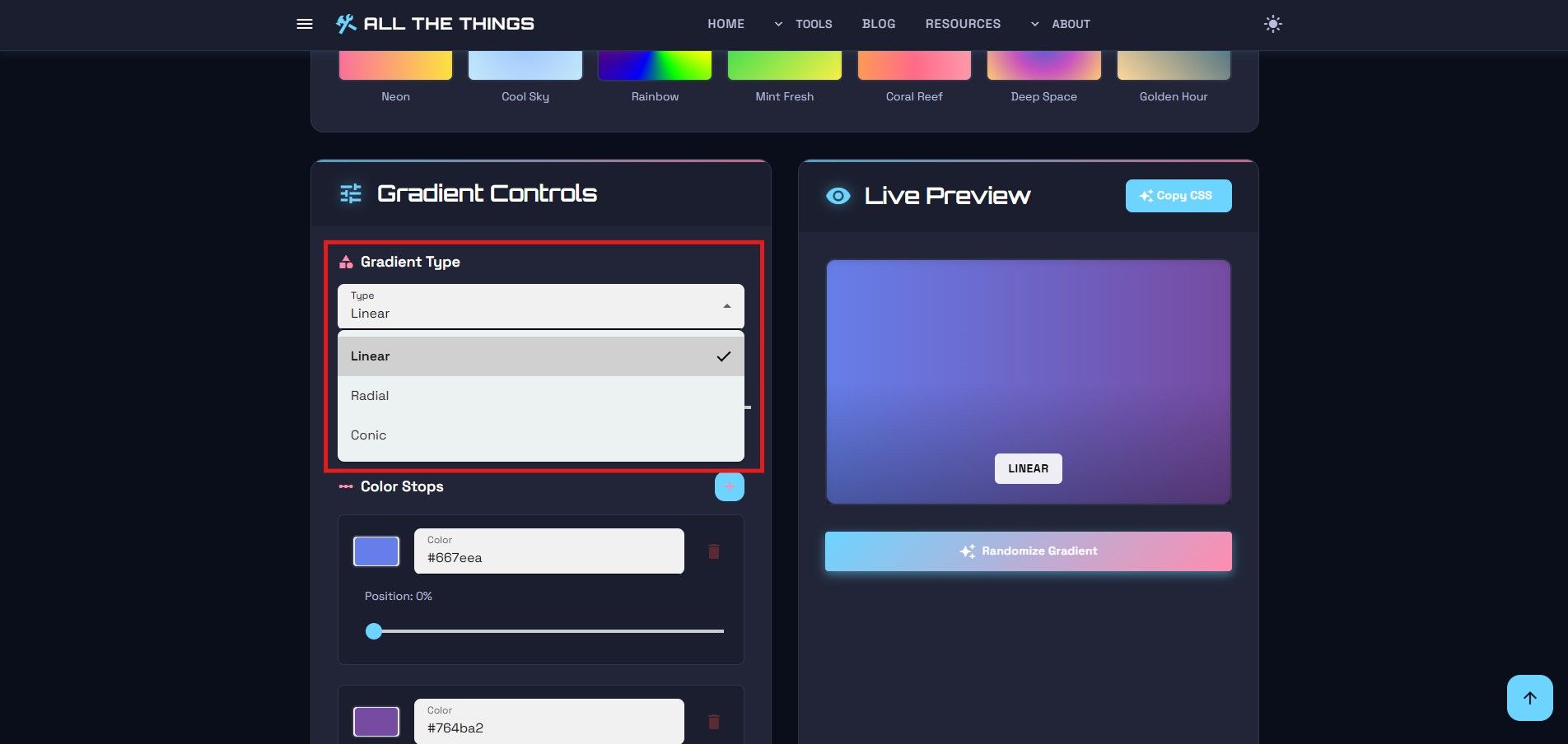
Click the type you want. The preview updates immediately. Linear is the most common - it's what you see in most website backgrounds and buttons. Radial works well for spotlight effects or subtle background accents. Conic gradients are less common but great for progress indicators or decorative elements.
Information
Pro tip: Linear gradients are the most browser-compatible and render fastest. Use them for critical UI elements where performance matters.
Step 2: Add Your Colors
Below the gradient type selector, you'll see color stops - the points where colors transition. By default, you start with two: one at 0% and one at 100%. Click a color stop to change its color using the color picker.
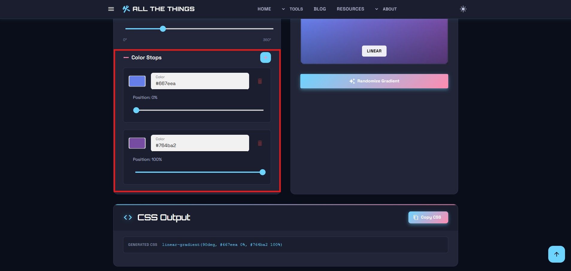
Need more than two colors? Click "Add Color Stop" to insert another point. You can add as many as you want. Each stop can be positioned anywhere along the gradient by dragging its slider or entering a percentage directly.
Information
For smooth, professional-looking gradients, stick to 2-3 colors. More than that often looks busy and amateurish unless you're going for a specific rainbow effect.
Want to delete a color stop? Click the trash icon next to it. You can't delete the first or last stop - gradients need at least two colors to work.
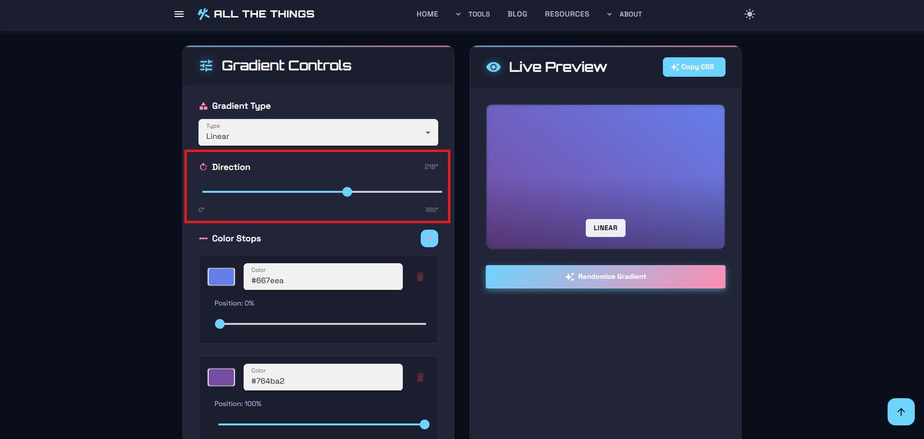
Step 3: Adjust the Direction
For linear gradients, you can control the angle. The default is 180 degrees (top to bottom). Drag the angle slider or type in a specific degree value. 0 degrees points straight up, 90 degrees goes left to right, 180 degrees goes top to bottom, and 270 degrees goes right to left.
For radial and conic gradients, you can adjust the position instead of the angle. This controls where the center point of the gradient sits - useful when you want the gradient to emanate from a corner or specific spot rather than dead center.
Step 4: Preview and Refine
The preview box shows your gradient in real-time. Every change you make - color, position, angle - updates instantly. This is where you fine-tune. Slide colors around. Adjust the angle. Add or remove stops. Keep tweaking until it looks right.
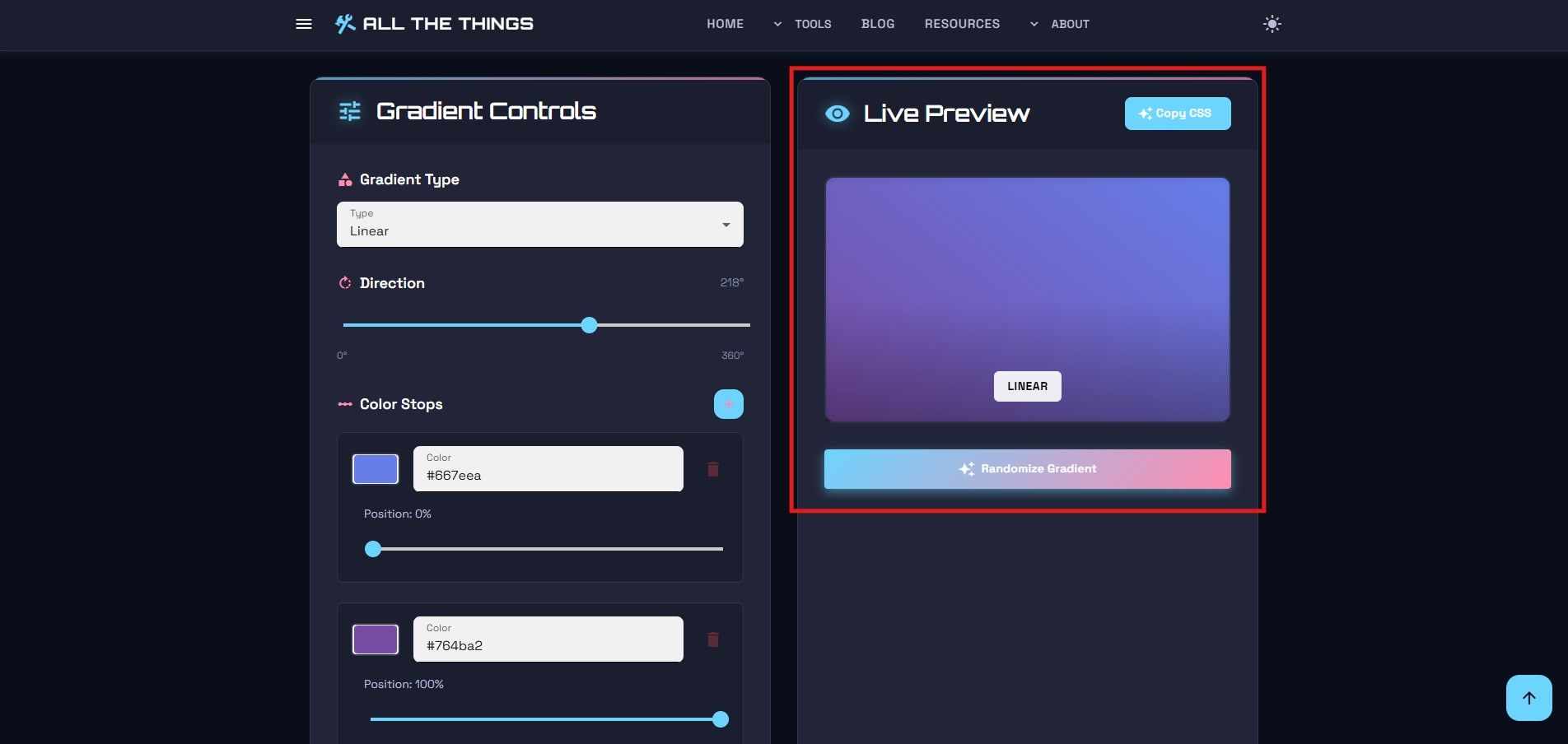
The preview is large enough to actually see what you're creating - not some tiny thumbnail that forces you to squint. What you see is what you get.
Step 5: Copy the CSS
Once you're satisfied with your gradient, scroll down to the CSS output section. The Gradient Generator shows you the exact CSS code you need, complete with vendor prefixes for maximum browser compatibility.
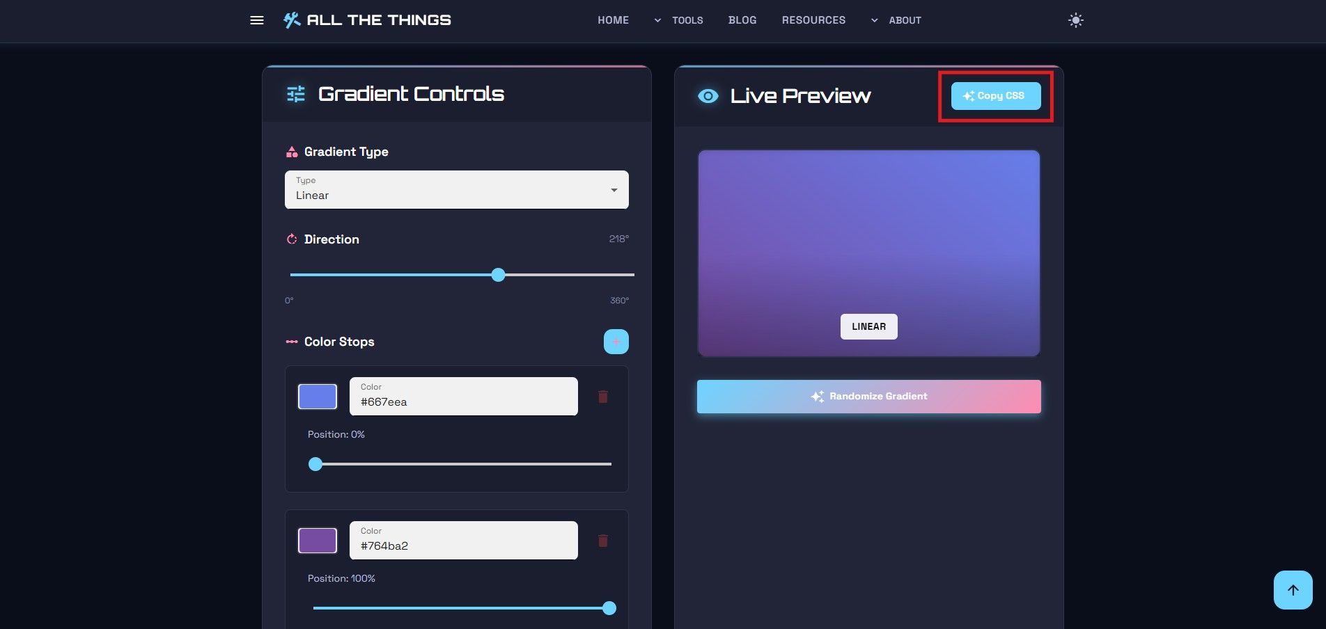
Click "Copy CSS" and paste it directly into your stylesheet. No manual formatting. No syntax errors. No wondering if you got the percentages right. It just works.
The code includes fallback colors for older browsers that don't support gradients. This means your design degrades gracefully instead of showing nothing to users on outdated browsers.
Why Use This Over Writing CSS By Hand?
Visual feedback. When you're typing hex codes and percentages into a text editor, you're flying blind until you reload the page. The Gradient Generator shows you the result immediately. No guessing. No trial and error. No reloading.
Plus, the CSS syntax for gradients is finicky. One misplaced comma or percentage sign and the whole thing breaks. The generator handles all that syntax for you. Copy, paste, move on.
Information
The generator automatically includes vendor prefixes (-webkit-, -moz-, etc.) to ensure your gradients work across all browsers, including older versions of Safari and Firefox.
And if you're not a CSS gradient expert (most people aren't), this tutorial and tool combination lets you create professional results without memorizing the syntax rules for linear-gradient(), radial-gradient(), and conic-gradient().
Common Use Cases
Here are some practical ways to use CSS gradients created with this tool:
- Hero section backgrounds - Subtle gradients add depth to website headers without overwhelming the content
- Button hover states - Gradient shifts on hover create engaging micro-interactions
- Card backgrounds - Light gradients make content cards pop without distracting from the text
- Loading indicators - Animated conic gradients work great for progress spinners
- Text overlays - Dark-to-transparent gradients help white text stay readable over images
The key is subtlety. The best gradients are the ones you barely notice - they enhance the design without screaming for attention.
Try the Tool Yourself
If you're tired of wrestling with gradient syntax or reloading your page fifty times to get the colors right, give the Gradient Generator a try. This tutorial covered all the basics, but the best way to learn is by experimenting. No account needed. No tracking. Just pick your colors, adjust the settings, and copy the code.
Visit Us On:
Stay in the Loop
Get notified when we add new tools and features
Thank You!
You're all set. We'll keep you updated with the latest tools and features.